

Waggin good branding, for the good boys' treats provider.
Waggie’s
Pet Food
Creative Concept
Branding
Naming
Visual Identity
Illustrations
Animations
Packaging Design
Web Design Copywriting
Social Media Design
Every dog is unique, so why do most of your friend's food packages look the same? Well, we asked ourselves the same question when we were designing the branding for Waggie's. We created a design that would immediately makethe brand stand out. Contrary to what many brands do, we did not go for flashy colors and numerous elements. Instead, we opted for minimalism, which isnot commonly seen in the market. However, our design is as cheerful and appealing as a pile of treats for your furry friend!
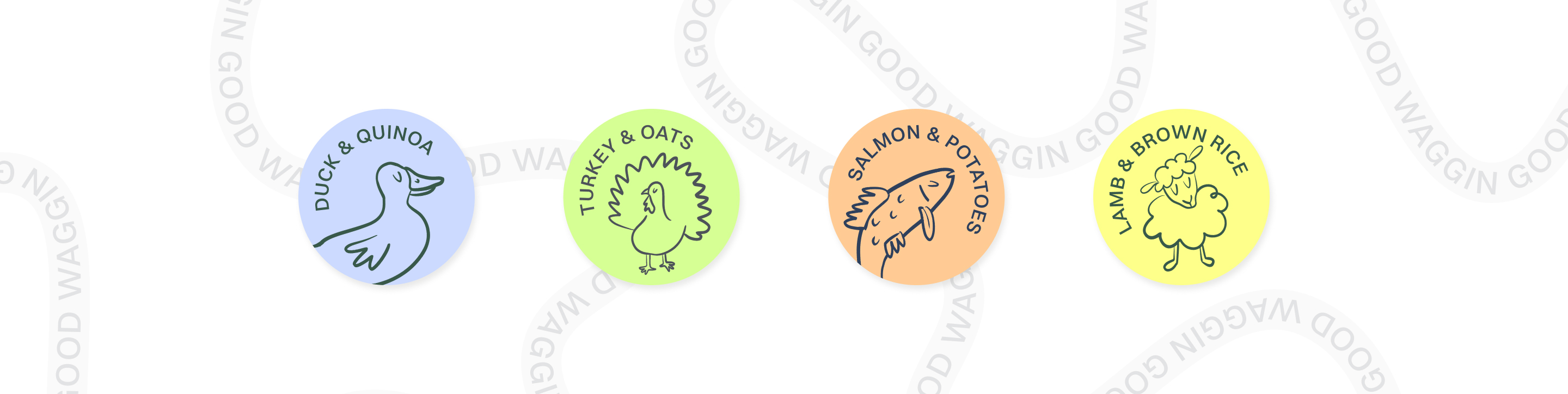
Firstly, we came up with the name waggie’s for our brand, as it sounds joyful and resonates with the wagging tails of dogs receiving treats from our brand. Our entire brand communication is centered around the PETS Happiness, including the copy, illustrations, and animations. The primary colors of our brand are subtle and are specifically chosen to meet the unique needs of each dog. The stickers indicating the taste of our products stand out distinctly against their respective backgrounds.
We chose a fun and playful logo that fits the brand's name. Our goal was to create a dynamic brand, so we used multiple o's in the phrase 'dog food' to create a unique typographic pattern that resembles little food balls inside the package. The aim is to make dog food that makes our furry friend happy while the branding makes their owner smile.
Lorem ipsum dolor sit amet, consectetur adipiscing elit. Suspendisse varius enim in eros elementum tristique. Duis cursus, mi quis viverra ornare, eros dolor interdum nulla, ut commodo diam libero vitae erat. Aenean faucibus nibh et justo cursus id rutrum lorem imperdiet. Nunc ut sem vitae risus tristique posuere.


Waggin good branding, for the good boys' treats provider.
Waggie’s
Pet Food
Creative Concept
Branding
Naming
Visual Identity
Illustrations
Animations
Packaging Design
Web Design
Copywriting
Social Media Design
Every dog is unique, so why do most of your friend's food packages look the same? Well, we asked ourselves the same question when we were designing the branding for Waggie's. We created a design that would immediately makethe brand stand out. Contrary to what many brands do, we did not go for flashy colors and numerous elements. Instead, we opted for minimalism, which isnot commonly seen in the market. However, our design is as cheerful and appealing as a pile of treats for your furry friend!
Firstly, we came up with the name waggie’s for our brand, as it sounds joyful and resonates with the wagging tails of dogs receiving treats from our brand. Our entire brand communication is centered around the PETS Happiness, including the copy, illustrations, and animations. The primary colors of our brand are subtle and are specifically chosen to meet the unique needs of each dog. The stickers indicating the taste of our products stand out distinctly against their respective backgrounds.
We chose a fun and playful logo that fits the brand's name. Our goal was to create a dynamic brand, so we used multiple 'o's in the phrase 'dog food' to create a unique typographic pattern that resembles little food balls inside the package. The aim is to make dog food that makes our furry friend happy while the branding makes their owner smile.


Cookies
Privacy Policy


.svg)